AI changes how fast you can be wrong. That's the point.
I'm using these to understand where AI genuinely accelerates design work, and where the craft still needs
a human hand. The models handle more than you'd expect. The initial intent and the judgment about when to
intervene - those are still very much the job.
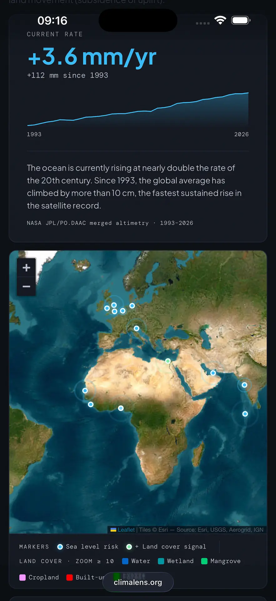
ClimaLens
Climate change is a hyper-complex system, and complexity is easy to misread. A snowstorm in New York
becomes evidence that the earth isn't warming. What it might actually mean is that the polar vortex has
shifted south, the polar ice is depleting, and the effects aren't appearing where people expect them to.
The instinct to deny what you can't directly observe is understandable. The tool to counter it is context —
specifically, the ability to place today's conditions against a baseline and triangulate across data
sources. If it's unseasonably cold here but the Mediterranean is 3.4 degrees warmer than average, the
picture changes.
ClimaLens started as a 15-minute mockup built to demonstrate a point about AI-assisted prototyping, how
quickly a working idea can take shape. Then the data got interesting, and the project kept going. The hard
part turned out to be finding and connecting the right sources.
The part still in progress is the narrative layer: making the story legible without requiring the user to already understand what they're looking at.
Next step is to find a way to show how these changes affect communities, even if they are far away. A good example is the Gulf Current, that makes the North Europe Climate more temperate than it should be. Data suggests that it's slowing down, and the conseguences may be severe.
It's a project that will likely be a never-ending work-in-progress. So is the climate.
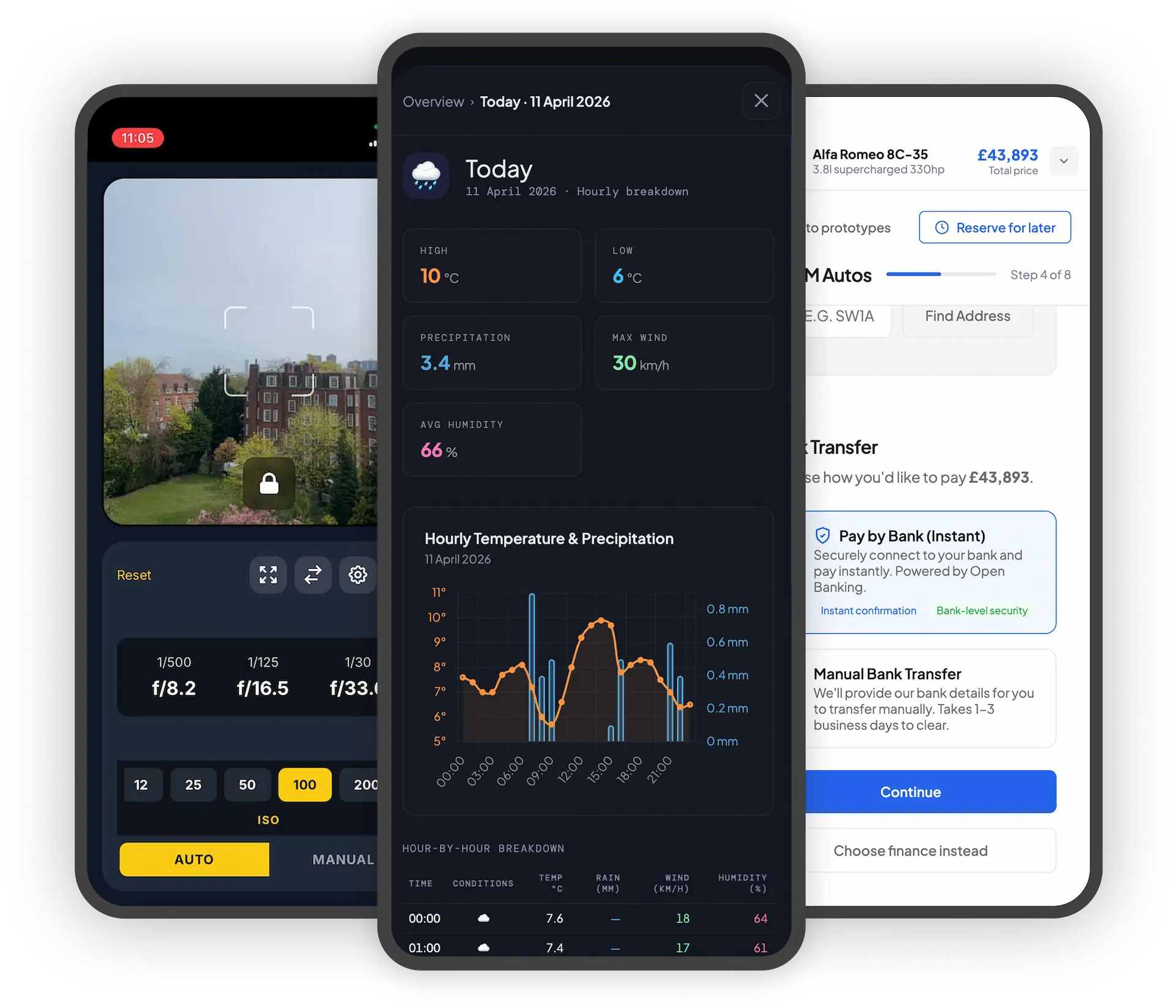
There's strong evidence that a step-by-step journey outperforms a single-page layout for high-commitment
purchases. We never managed to implement one. So I asked a different question: how much of that gap can
be
closed by improving what exists?
The main failure modes of single-page checkouts in this context are well-documented from research:
information overload, poor scroll behaviour that disorients rather than guides, difficulty revisiting
completed steps, and — critically — no clear signal of what commitment each action actually requires. For
a
purchase this emotionally dense, "clean" reads as "rushed."
This prototype tested whether better information hierarchy, persistent explanatory panels, and a payment
model that treats all funding methods as equal options — rather than forcing a cash/finance fork early —
could make the single-page experience feel genuinely navigable. In usability testing, users described it as
"smoother" and, notably, not "pushy."
Building it with AI assistance changed what was testable. Coded prototypes let users move freely — going
back, changing decisions, exploring paths not scripted in advance. That freedom produces more genuine
behaviour than click-through mockups, and more honest findings.
It also compressed the time between idea and test to a fraction of what traditional prototyping requires.
Mapping the journey and sketching the scenarios was enough to start building — and watching it take shape in
code made the process generative in a way static mockups aren't. Sub-journeys got reconsidered, interactions
got refined, overlooked scenarios got caught, all before a single user sat down with it. The output
wasn't
just faster — it was closer to production, which meant the testing was closer to real.
Note that it's a transactional process, so you will be asked a lot of questions. Add anything you fancy,
but no real personal details. Even if you do, there are no services attached. Everything stays in
your
session cache.
picture used for the prototype has been taken by Massimo Campi and published on Motor
Emotion.
 Try it on your mobile device
 Try it on your mobile device

